Benjamin Moore 2026 · Project Guide
Stop Guessing: 4 Colour Palettes That Actually Match the Feeling You Want
March 11, 2026 · 8 min read · Salmon Arm Paint Centre
Spring is the season people finally tackle that room that's been bugging them. But here's the thing most people get wrong — they start by picking a colour. The better move? Start with a feeling.
What do you want that room to do for you? Should it calm you down after a long day? Make your guests feel welcome? Give your kitchen some energy? Once you know the feeling, the colour picks itself.
Benjamin Moore's 2026 Colour of the Year — Silhouette AF-655 — and its companion palette of 7 coordinating colours are all about layered, intentional spaces. No more guessing. No more painting a wall and hating it two weeks later.
Below, we've organized the 2026 palette into 4 distinct moods. Find the one that matches what you want, and you've got your starting point.
And if you're still not sure? Walk in. Our colour experts will help you dial it in — no appointment needed.
Watch
Benjamin Moore's official 2026 Colour of the Year reveal
Can't see the video? View the 2026 Colour of the Year on benjaminmoore.com
The 2026 Palette at a Glance
Silhouette
AF-655
Swiss Coffee
OC-45
First Crush
CSP-310
Raindance
1572
Batik
AF-610
Narragansett Green
HC-157
Southwest Pottery
048
Sherwood Tan
1054
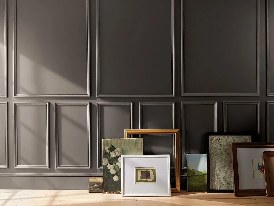
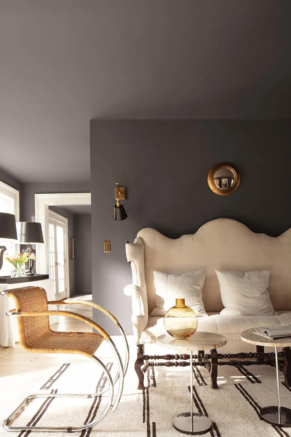
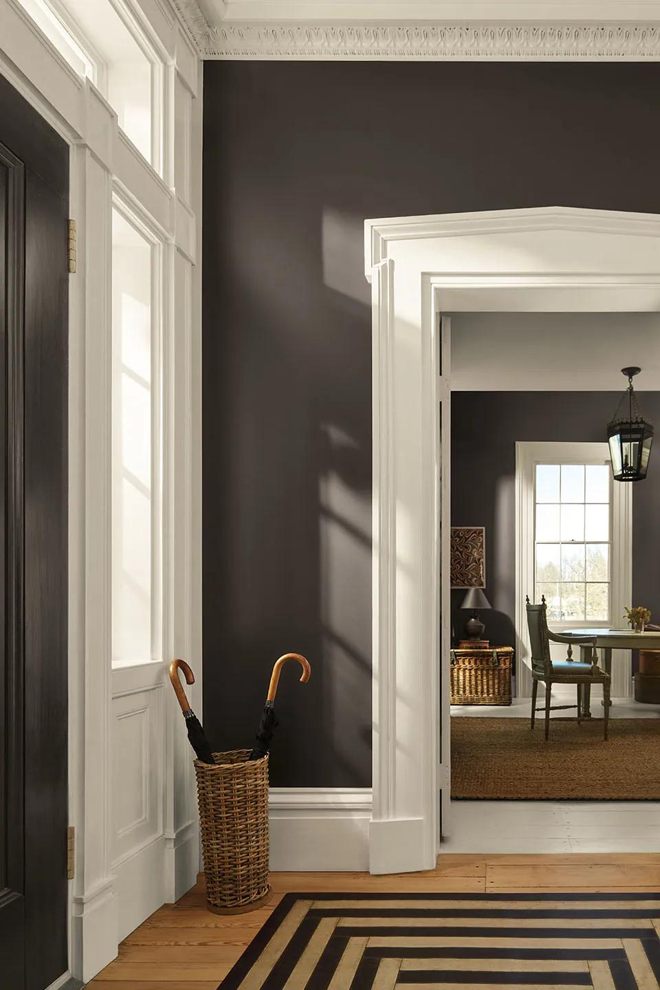
Mood 1
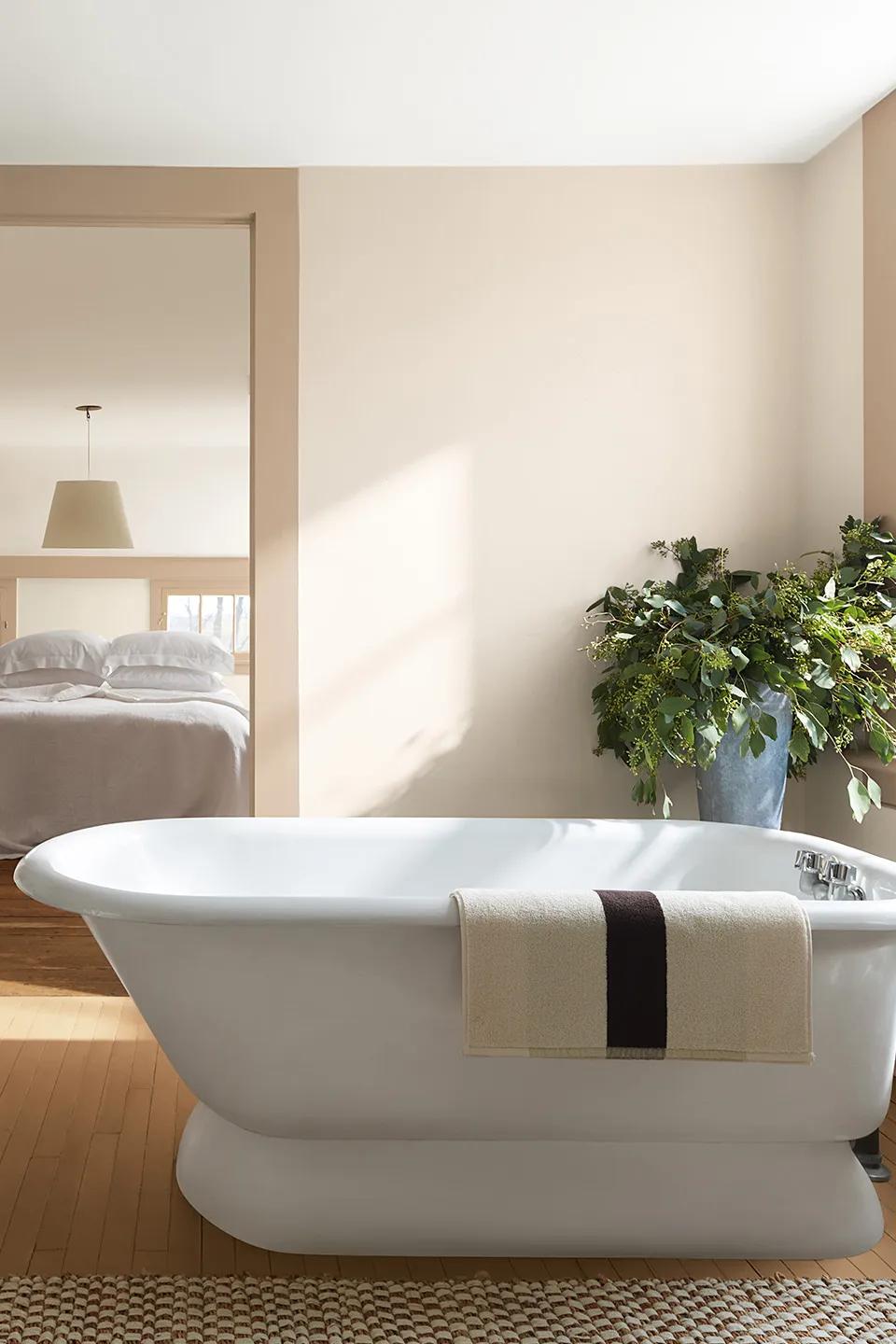
The Cozy Cocoon
Warm · Intimate · Grounded
The Feeling
You want a room that wraps around you. Think: the bedroom you never want to leave on a Sunday morning. The den where you read. A dining room that makes a Tuesday dinner feel like an occasion.
The Colours
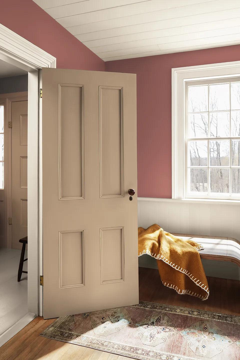
Silhouette AF-655
Deep espresso-meets-charcoal. Use on all walls for a full colour-drench effect. The depth creates intimacy without feeling heavy when paired with the right trim.
Swiss Coffee OC-45
Warm, creamy off-white. Use on trim, doors, ceiling. The contrast against Silhouette is what keeps the room from feeling like a cave.
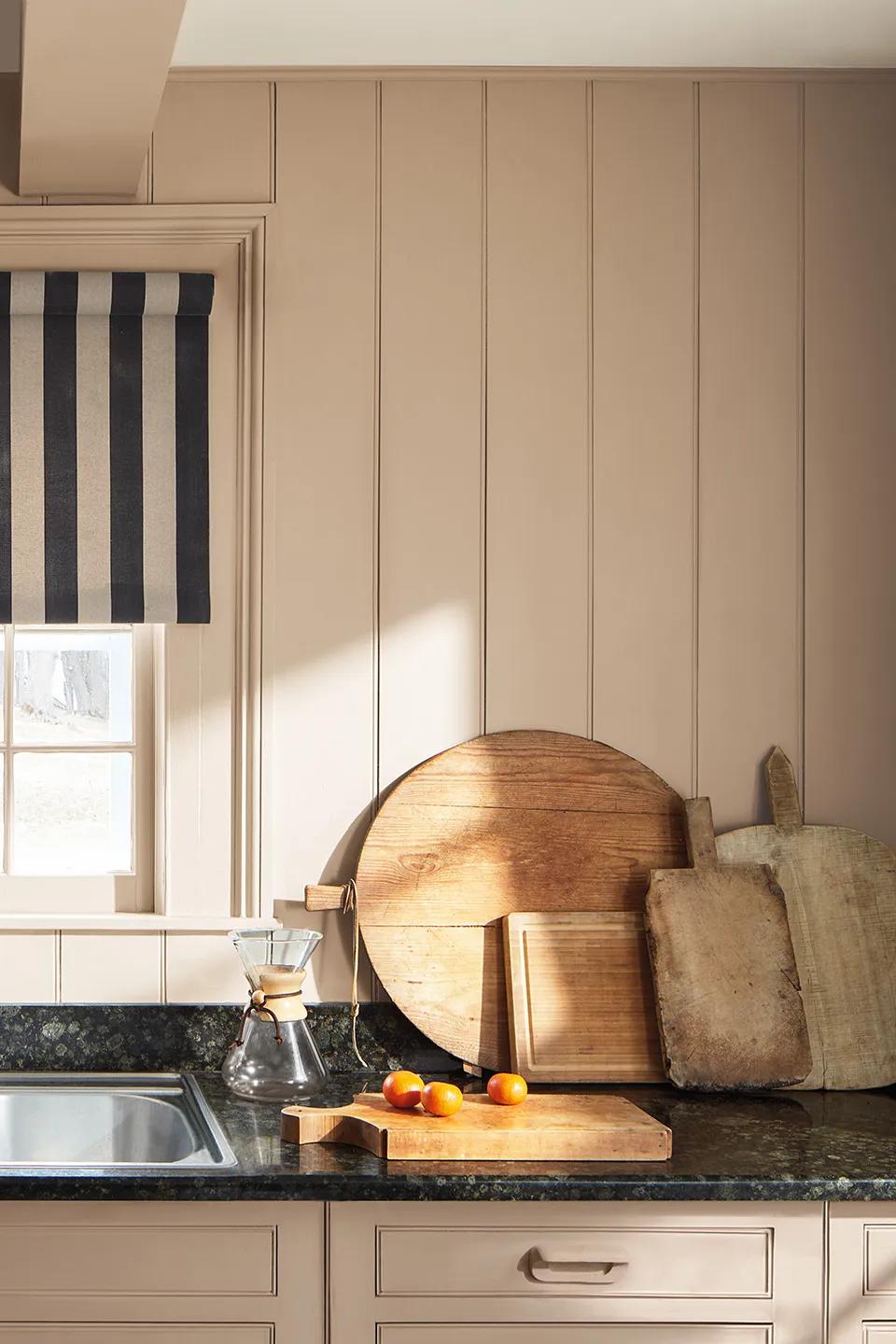
Sherwood Tan 1054
Grounded golden tan. Use on accent furniture, textiles, or a secondary wall to add warmth without competing.
Where It Works Best
Primary bedrooms, dens, formal dining rooms, reading nooks, home offices where you want focus.
Pro Tip
Silhouette looks different in every light — cooler in north-facing rooms, warmer in south-facing. Always test with a large sample before committing. We have peel-and-stick samples in store.
Product Note
For walls in Silhouette, we recommend Aura Interior in Eggshell — the richest colour payoff in fewer coats. For trim in Swiss Coffee, Aura Interior in Semi-Gloss gives the perfect sheen contrast.
Mood 2
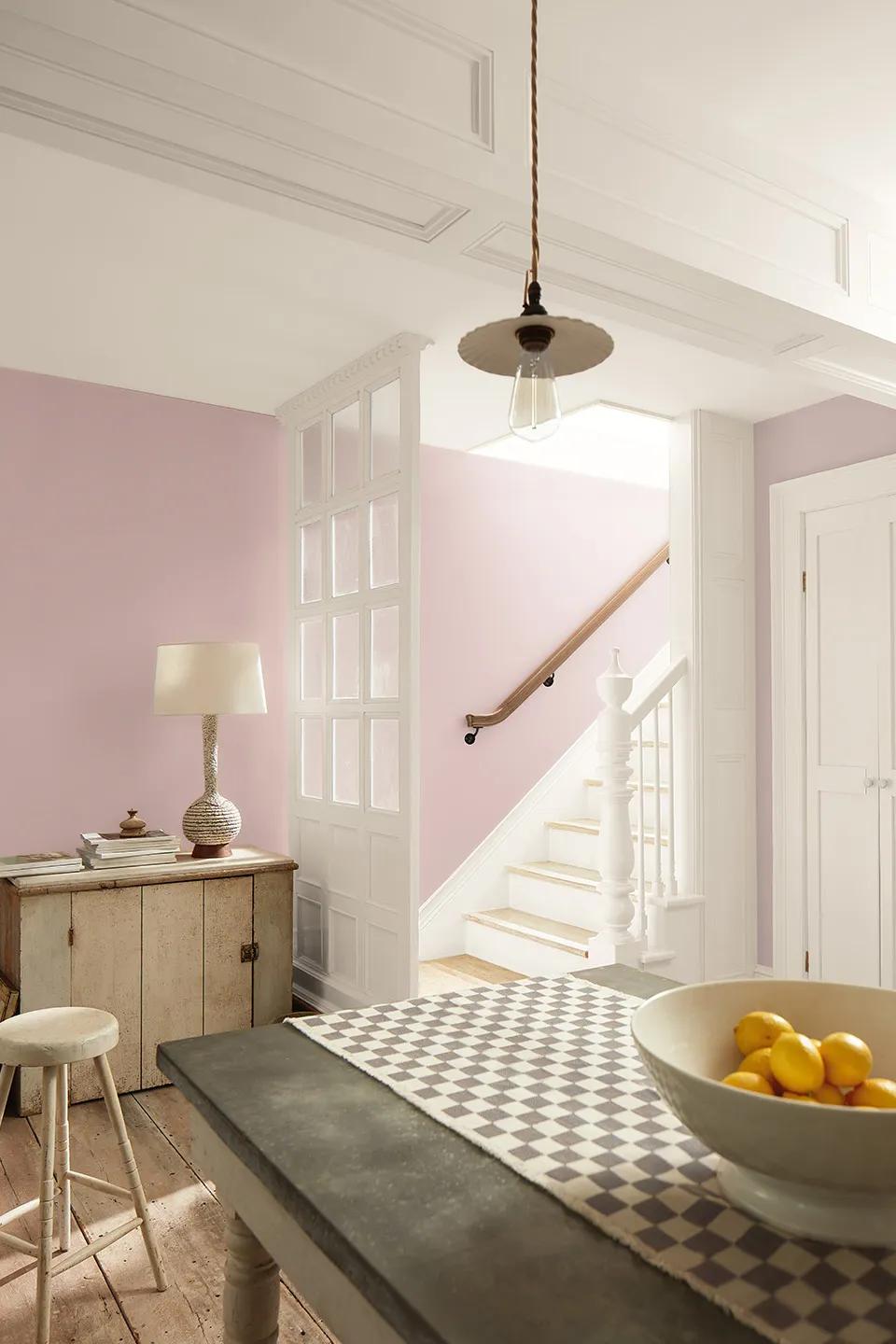
The Soft Refresh
Light · Calm · Airy
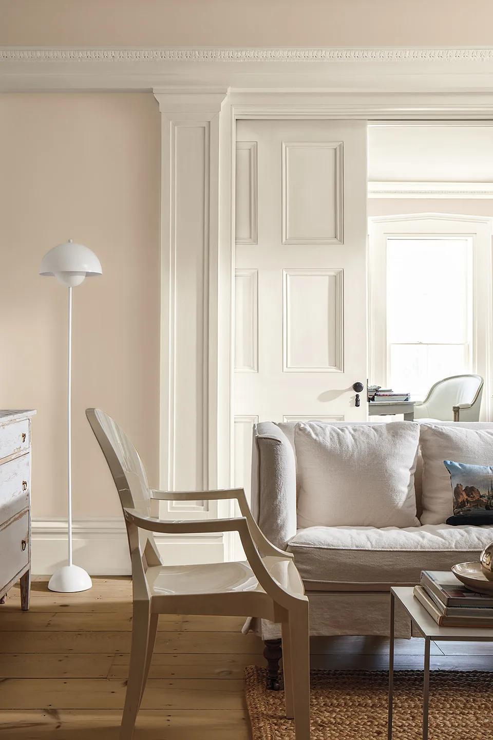
The Feeling
You want a room that exhales. Clean without being sterile. Bright without being cold. This is the palette for someone who loves neutrals but wants them to actually feel intentional — not default.
The Colours
First Crush CSP-310
A barely-there blush with pink warmth. Reads as a sophisticated neutral on the wall, not "pink." Perfect whole-home foundation colour.
Swiss Coffee OC-45
The essential warm white. Use on trim, built-ins, ceilings. Plays beautifully with everything.
Raindance 1572
A steely sage green with grey undertones. Use as an accent — on a door, in a powder room, or on built-in shelving.
Where It Works Best
Living rooms, bathrooms (especially with natural light), guest bedrooms, open-concept main floors, nurseries.
Pro Tip
First Crush is the kind of colour that looks like "nothing" on a small chip but transforms a room. Trust the large sample. We see this one surprise people every week.
Product Note
For bathrooms, use Aura Bath & Spa in Matte — specifically designed for moisture resistance. For living areas, Regal Select Interior in Eggshell gives great washability at a strong price point.
Mood 3
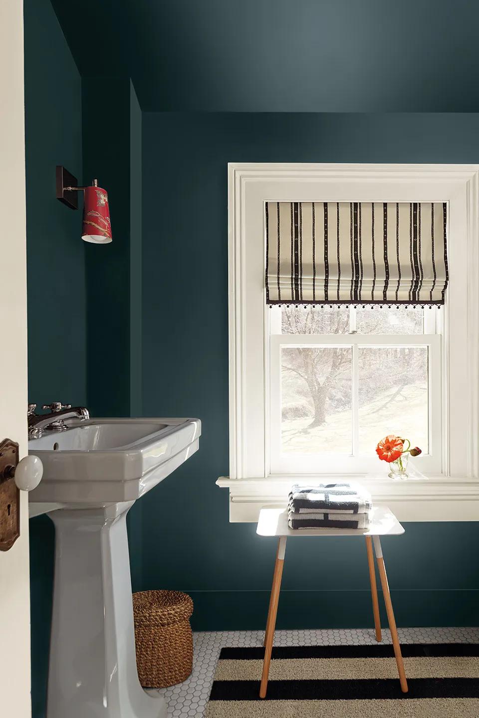
The Bold Statement
Dramatic · Confident · Architectural
The Feeling
You're not afraid of colour. You want a room that has presence — one that makes people stop when they walk in. This palette brings depth and drama without going over the top. It's bold, but it's sophisticated.
The Colours
Narragansett Green HC-157
A blackened teal with serious historical weight. Colour-drench a powder room or bathroom for maximum impact. This is a show-stopping colour.
Batik AF-610
Dusty violet-rose. Moody and unexpected. Use on a kitchen island, a staircase wall, or as a secondary room colour to Narragansett Green.
Swiss Coffee OC-45
The counterbalance. Crisp white trim prevents bold colours from feeling oppressive.
Where It Works Best
Powder rooms, feature bathrooms, dining rooms, entryways, staircase walls, home libraries.
Pro Tip
Dark, saturated colours like Narragansett Green need premium paint to get the depth right. Cheap paint on a dark colour shows lap marks and inconsistency. This is where product choice genuinely matters.
Product Note
For Narragansett Green on walls and ceiling, use Aura Interior in Satin — the best self-levelling and colour depth in the Benjamin Moore lineup. Worth every penny on a feature room.
Mood 4
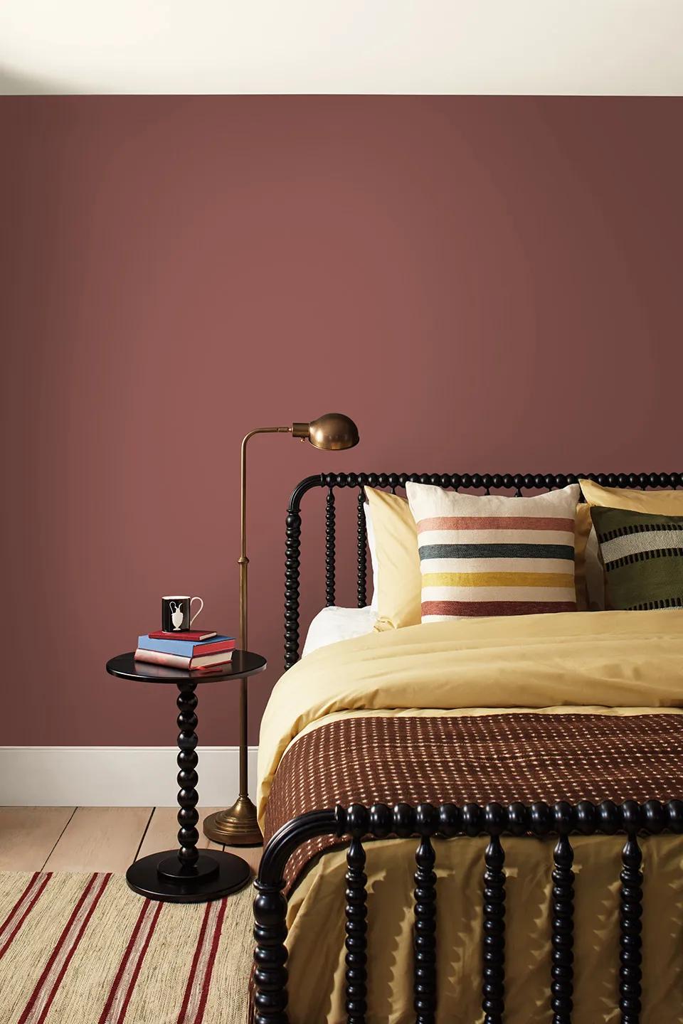
The Earthy Retreat
Warm · Natural · Collected
The Feeling
You want your home to feel like it grew there. Natural textures, warm tones, nothing forced. This is the palette for people who love natural wood, linen, woven baskets, and want their paint to play that same tune.
The Colours
Southwest Pottery 048
Sunbaked terra cotta with depth. Warm clay tones that feel timeless, not trendy. Bold enough to anchor a room, earthy enough to stay grounded.
Sherwood Tan 1054
Golden, sandy warmth. Use on shiplap, built-ins, kitchen walls, ceiling beams. Gives a collected, layered warmth.
Swiss Coffee OC-45
The breathing room. Ceilings, trim, open shelving.
Where It Works Best
Kitchens, bedrooms, mudrooms, covered porches transitioning to interior, family rooms, cabins and lake homes.
Pro Tip
This palette is perfect for Shuswap lakeside homes. Southwest Pottery brings warmth in winter and feels connected to the landscape in summer. Pair it with natural wood and you're done.
Product Note
For Southwest Pottery on bedroom walls, Aura Interior in Eggshell gives the richest colour. For Sherwood Tan on kitchen shiplap or beams, Regal Select Interior in Satin/Pearl stands up to daily use and wipes clean.
Your Colour Is Waiting
Every one of these colours is in stock at Salmon Arm Paint Centre. We carry the full Benjamin Moore 2026 Colour Trends palette, plus thousands of other colours matched to your space.
Not sure where to start? Two ways we can help:
Walk in for free colour advice.
No appointment needed. Our team can talk through your room, your lighting, your style, and narrow it down in minutes. We do this every day.
Book a formal colour consultation.
Our interior designer Geri does in-home visits to build a complete colour palette for your space — considering your lighting, furnishings, flooring, and flow between rooms.
885 Lakeshore Dr SW, Salmon Arm · Mon–Fri 7am–5pm · Sat 9am–5pm